Being the IT-guy aka personal first-level-support™ for way more people than I am comfortable with, I have held quite a few mobile phones in my hand and stared into the abyss that is their home screen. The home screen is the modern view into someone’s soul. In a post-privacy-world it is probably one of the most private things we have, since it is utterly worthless to someone who does not interact with it on an hourly basis and has grown to live with whatever way the apps are scattered around the screen.
I am also the guy who tends to optimize some things beyond any reasonable limit. Thus I present to you:
The KPIs of Home Screen Layout
The Key Performance Indicators for the home screen are:
- Number of average page swipes
- Number of average folder-clicks
- Individuality of color compared to the up to eight apps around it
- Reachability with the right thumb
- Compatibility with other apps on same page
Always remember: We optimize for speed, i.e., the time span from I want to open [App] to actually clicking the right App.
According to the KPIs, the ideal system has
- one page,
- no folders,
- different colors,
- more important apps at the bottom,
- very similar apps.
If you look at the home screen Apple ships their iPhones with you start to realize that I am not the only crazy person who ever thought about this:
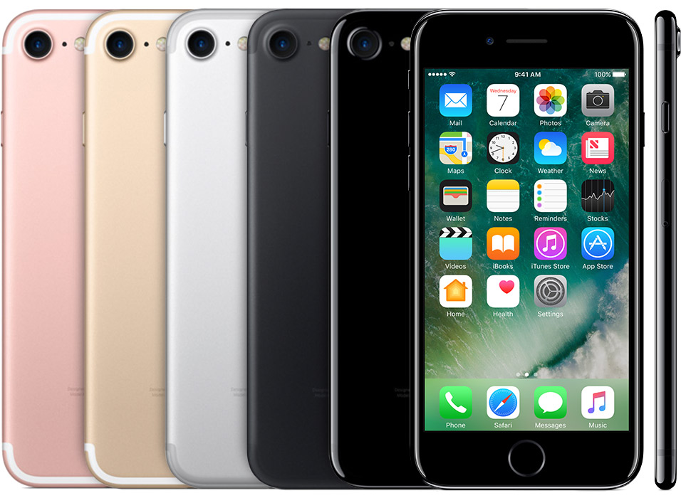
Side note: Considering the importance of apps at the bottom, do not think user, think Company that sells apps, music and books.
Considering the colors: Messages used to send only SMS, which were closely related to the phone-functions. Before visual voicemail you would get an SMS for a missed call. Also note that WhatsApp uses the same color and shading.
Using the KPIs
No what about this perfect layout? As you might know from the wisdom that James Mickens has brought us, there is just one true metric for how good a developer is: window placement. (If you didn’t know, watch and learn!)
This can be applied to the mobile world as well. And while the concrete implementation is highly personal and depends on how passionately you download every single free App of the Foo, I have found that for every category of apps there are only about three I use, let’s say, every week. So the rule we can deduct from all this is:
- one row per category
- direct access to the three most important apps
- adjacent to those a folder with the rest of the category
The last point actually allows to use the folder name as the heading for a row, in case you need to start searching.
Result
And now I present to you: the view into my soul:
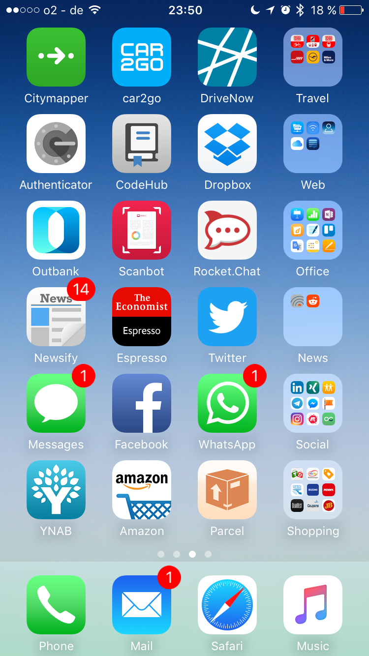
The most important apps are located in the left-most column, which is, I know, not ideal for my right thumb, but I read from left to right and favor starting with the most important information. Also, all the Apple system apps are missing. They are on the first page, since, as I pointed out, Apple has done a sufficient job at placing them.
I am actively enjoying this layout for a week now, and so far it has saved me approximately 10 minutes of thinking “what else did I want to look at”. I started using that extra time to optimize the mess that lurks on page three, aka the dump.